Wednesday, March 31, 2010


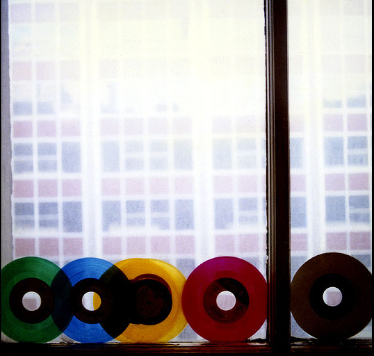
I really like this photo taken by Danny Clinch. I like how the brightly colored records stand out against the background, which kind of is dull in color. I also like how the window frame cuts right through the picture at a rule of thirds. I think it adds a little more depth to the picture and if that window frame was not going through the picture it would not be as powerful. I also like the lighting and how the light streams through the records to make the records brighter. If you want to see more pictures by Danny Clinch, you can click here: http://www.dannyclinch.com/index2.html

Monday, March 22, 2010


This photo was taken by Danny Clinch. The subject of his photo is Jack White. Jack White is one of my favorite musicians so that I a big reason why I like this photo. I also like this photo because of the color contrasts. I like how the red in his outfit and the red in the stage contrast with the dark, almost black sky. The two guitars in the bottom of the photo help frame Jack White. I also like how "in the moment" this photo is. I like how it's not posed and that Jack white is just caught up in his performance and just playing his guitars to the best of his abilities. Another thing I like is the way that the stage lights add a contrast and kind of a "pop" to the photo. To see more of Danny Clinch's photos you can click here: http://www.dannyclinch.com/index2.html

This photo was taken by David Hurn. I really like the way that the picture is layed out. I like how the lighthouse and the hotel are off center and that it follows the rule of thirds (two-thirds hotel and one-third beach). I also like how, if you look closely, you can see two people at the end of the hotel. They are alone on the beach, and it sort of makes you think about the background story. I also like how the beach, water, and sky are similar colors but the lighthouse and the hotel have colors that stand out and bring your eye to the photo. If you want to see more pictures by David Hurn you can click here: http://www.magnumphotos.com/archive/C.aspx?VP3=ViewBox&ALID=2K7O3R135UHJ&IT=ThumbImage01_VForm&CT=Album

Thursday, March 11, 2010

I really like this photo taken by W. Eugene Smith. I like how the man's eyes are contrasing with the black background. His eyes also follow the rule of thirds (on one of the horizontal thirds). I also like how his eyes are filled with fear and pain and it looks like he is trying so hard to just make it through. I also really like how the man is following the rule of thirds also. The basically solid black background takes your eye to the man and especially his eyes. This picture overall is very powerful and if you want to see more photos by W. Eugene Smith you can visit here: http://www.magnumphotos.com/archive/C.aspx?VP3=ViewBox&ALID=2K7O3R13EV6E&IT=ThumbImage01_VForm&CT=Album


Tuesday, March 9, 2010


This photo was taken by Josef Koudelka in Northern Ireland in 1978. I really like this picture for many reasons. One is that the tree on the left side of the picture follows the rule of thirds and it causes your eye to drift to the left. I like how the odd tree with the gnarled branches kind of disrupts the flat, kind of desolate farm road. I also really like the street lines that are bright white that go through the photo. I think it adds a pop of bright white and it adds another element to the picture. Also, I like how he followed the rule of thirds when he used 2/3 ground and 1/3 sky. The tree on the left is at a slant and so that adds motion to the photo. The road is also curved and that adds motion.

Friday, March 5, 2010


I really like this photo by Mark Power taken in 2005 in Poland. I really like the contrast between the really white backgorund and the bright red posts. The post is sort of in the center, so it brings your eye right to it. Also the hill in the background the the post are at an upward slant. That causes diagonals which makes the picture have movement. I also really like that there isn't very much in the picture just the pretty white and desolate background and the red posts. I think that the simplicity adds to the attraction to the photo. The photo doesn't have much it pulls you in and makes you really take a look at the picture. You can see more of Mark Power's pictures here: http://www.magnumphotos.com/Archive/C.aspx?VP3=ViewBox&ALID=2K7O3R13LY3H&IT=ThumbImage01_VForm&CT=Album

Wednesday, March 3, 2010

Old Vs. New


I really like this picture by Rene Burri. The rule of thirds is used in this picture and the building is not in the center which adds more depth to the picture. The man in the lower right corner also follows the rule of thirds. I really like the way that the old church building is between the new building and it is kind of like an old vs. new thing that I like. There is also a frame around the old building that brings your eye to it. One side of the frame around the old building is at a diagonal and it creates in movement in the picture. All of these things help make the picture really stand out in my mind. You can see more pictures by Rene Burri at this website. http://www.magnumphotos.com/archive/C.aspx?VP3=ViewBox&ALID=2K7O3R14WFCK&IT=ThumbImage01_VForm&CT=Album